How NOT to Develop New Software
 November 6, 2007
|
Posted by Aubrey Turner
November 6, 2007
|
Posted by Aubrey Turner
Delivering good software can be a challenging process, especially so when numerous development and design principles have been ignored or violated. I was recently reminded of this due to my exposure to Verzon’s new FIOS TV Interactive Media Guide. A month or so ago I received a letter telling me that I would soon be seeing a new interface on my DVR. The day before the roll out I got a phone call telling me about the coming “upgrade” and pointing me to the website for a tutorial. This should have been a warning to me that something was up.
I’ve been in the software business for about 14 years now, doing everything from tech support to programming to systems design. Over that time I’ve learned a thing or two about delivering software as well as about UI (User Interface) design. While UI is not my specialty, it’s something that I have to take into account while doing design work. Whenever you have a system that is going to be used by people (rather than other systems), then you have to think in terms of the user while doing your design.
Anyhow, I told you that so I could tell you this: It is my considered opinion that the Verizon FIOS TV Interactive Media Guide as it exists today is an unmitigated piece of crap. The UI is so flashy as to be difficult to use and distracting. It’s slow. It’s unreliable. It’s inconsistent. It represents a failure in requirements analysis, ignorance of UI design principles, and its implementation and roll out demonstrates an utter lack of understanding or consideration of UCD principles.
Lest you think I’m just bloviating, allow me to give a few examples.
The first (and most egregiously annoying) mis-feature is the “fixed focus” program guide. Here’s what it looks like:

As you press Up or Down Arrow the “highlight” stays fixed and the guide data moves underneath it. It’s kind of like looking at a specimen through a microscope by moving the slide around underneath it. Unfortunately, I find this highly distracting and somewhat nauseating. First, I tend to think spatially. This means that I think of my local channels as being “up there” on the guide, things like Discovery (channel 100) being “in the middle,” and the HD channels being “down there” (800’s). Scrolling through with the old program guide was kind of like navigating in a video game, in that I could correlate spatial position to channels. My brain is also accustomed to scanning the entire page at once. My usual Sunday morning activity is to open up the guide, enter 100, and then scan across the Discovery channels to see if there’s anything interesting on. And I do this a page at a time. It’s kind of like a visual “grep.” With the new guide, the huge visual wart in the middle interferes and causes me to have to refocus on the top and bottom halves separately, which interrupts my visual comparator and makes me irritable.
Anticipating objections, though, I will admit that this is a personal thing. There might be people who like looking at things through a microscope. I’m just not one of them. Still, I bring it up because there is no option to use the old style of guide. This indicates to me that they didn’t talk to any users during design, didn’t talk to enough users if they did talk to any, and/or ignored feedback from the initial victimstesters. A good design would have take human factors into account and would have either not used the fixed focus method or would have allowed for an alternate guide format. More on this towards the end…
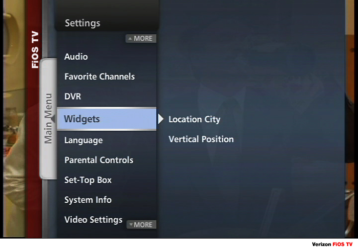
They have implemented a “tabbed navigation” system for the menu system, which is shown above. This system has several issues, mainly in being inconsistent and violating the principle of least astonishment. For example, pressing Right Arrow causes the next level menu to be activated. The interface shows you the options in the next level menu as it’s displaying the upper level. Unfortunately, if the list is long it attempts to center the list and the arrow points to something in the middle. When you press Right Arrow to go into the next level menu it takes you to the top of the list, rather than the item to which the arrow was pointing. This is surprising and annoying. It should always go to the item that the arrow is highlighting.
Further, it’s not consistent, as when you get to “leaf” items (i.e. lowest level items in the menu), pressing Right Arrow does nothing. You have to highlight the item and hit OK. The old version of the IMG let you use Right Arrow, so not only is the new version inconsistent, it removed previously useful functionality.
The interface is also horribly slow and it provides no feedback that a request has been received or that an operation is under way. This is a cardinal user interface sin. Both the guide and the ‘My DVR’ function take 1.5 to 2 seconds after the button press to appear on my system. There is no change in cursor, no change in interface color, nor is there a sound to indicate that the button press has been received and that the data is being gathered. I forget where I originally saw this, but most UI guides require acknowledging a button press within 0.1 seconds. The operation can take longer, but you must give an indication that you received the button press and that the operation is under way. Of course, the first thing that comes to mind is to use some sort of sound, but that gets annoying quickly (it was the first thing I turned off back when I had a Tivo). So there has to be some sort of visual indicator on the screen to show that a button press was received and that an action is under way.
This can be more than just an annoyance, by the way. Users, thinking that nothing has happened, may be tempted to press the button a second time. If the particular button can cause a selection to be made and then cause some action on that selection, there may be trouble. The old version of the IMG had this problem, in that it (like its successor) did NOT acknowledge button presses and would often appear to be hung. I accidentally deleted a couple of recordings by hitting OK too many times, thinking that the system had missed the first button press.
There are examples like this throughout the IMG, and it would take me forever to enumerate them. Fortunately, someone else has already done so on the FIOS TV forum of DSLReports: IMG Bugs and Missing Features FAQ
I mentioned earlier that there didn’t appear to be much user feedback incorporated into the design. I find this to be the most egregious sin of the entire project, and it’s not so much a failure of the development team as it is of the Verizon management. I say this because they have been rolling this thing out for months and they have known since the first deployment that it was bug-ridden and that many people hated the new guide. Rather than step back to incorporate the feedback, they continued rolling out the system.
It’s clear to me that either Verizon management wasn’t hearing the same story as their customers were telling, or they simply didn’t care. On August 3rd, John ‘CZ’ Czwartacki (Executive Director – External Communications) posted an article on the Verizon PolicyBlog about how they were generating such great buzz over the new FIOS TV IMG with bloggers. This lasted until the 9th, when frustrated customers found the blog entry and deluged him with over 100 comments about the ways in which the new IMG sucks.
But it was this response that told me that Verizon management doesn’t get it:
UPDATE (9/18/07): We hear you! Thanks for all the great comments and suggestions. We’ve incorporated many of them into a maintenance release that we intend to deploy shortly after we finish deploying version 1.0 across the country. Keep the feedback coming.
So they intend to give everyone the crappy IMG before they send out the fixes. It seems pretty stupid to me to expose your customers to a bad, buggy, interface and then fix it (especially if the new IMG can delete recorded programs, mess up scheduled recordings, cause random reboots, and generally wreak havoc with your settings). It sounds like someone let the programmers make that decision, rather than doing the right thing and making a new combined image with all the fixes rolled in. Given how long this thing has been out there, and how loud the screaming has been, I should never have received such a bug-laden piece of crap on my DVR at the end of October. That’s simply inexcusable.
 Categories: Technology
You would completely grok the TiVo guide. List of channels that you navigate through page by page on the left side (with current program), and the next 8 or so programs on the selected channel shown on the right side of the screen, all with category based filtering.
And if you don’t like it, they have the standard grid style guide available too.
The post was getting pretty long, so I didn’t bother to go into my history with TiVo. I had a Series 2 for a long time before I got FIOS. But with FIOS, my only options for HD were to go with the FIOS DVR (the Series 3 wasn’t available at the time). I gave my Series 2 (w/lifetime membership) to some friends when I got the FIOS DVR.
The FIOS DVR’s UI has always sucked. I had just managed to arrive at a truce with it until IMG 2.0 was foisted upon me.
As far as I’m concerned, TiVo is the ne plus ultra of DVR interfaces. I came within a hair’s breadth of buying a TiVo HD on Sunday, but decided to wait.
There’s a problem with TiVo HD (as well as Series 3) and Verizon FIOS that needs to be resolved before I’m comfortable putting any money down on a new TiVo and service contract. And on the other hand, Verizon is promising fixes at some point in the near future for their crappy IMG.
I’m kind of in a holding pattern watching both issues to see which one gets fixed first. In the meantime, I’m staying with the FIOS DVR out of inertia.
So, this only affect Verizon’s DVRs? The normal set top boxes seem to have an older GUI in my area.
As far as I know, it’s only the DVRs. I have a second (regular) set top box in the bedroom and it hasn’t been “upgraded.”